
To the stars
for healthier, happier dogs and cats
The future of pet health
A name communicates a lot about a company. Values, aspirations, even the customer proposition. Astro Pet Health, founded in 2021, wanted to modernize the way humans store and track their pets' health data.
I was engaged very early during Astro's bootstrapping to work on the consumer brand, and then to develop design and functional specification for the MVP version of their flagship mobile app.
The Astro visual brand — the name having been chosen by the founder long before bootstrapping the business — underwent a development process, led by me, called Stylescaping. It's an upleveled version of the better known process of moodboarding, and is informed by a brand truths kickoff exercise I guided the co-founders through as a first step. Stylescapes allow a client to see in-situ examples of several proposed brand expressions in order to engage in a conversation about which one best captures the intended style.


The first concept used restrained colors and simple forms to emphasize brand values of trust and ethics. I included elements of play, such as offset strokes on the icons, to indicate a need to keep this look from becoming too staid if it was brought forward for further revision.

The second concept included a substantially more playful logo, creating the shape of the "A" in the name out of one half of a dog's face. The color palate was brightened, and I included some sample illustrations that might inspire the look and feel as it developed.

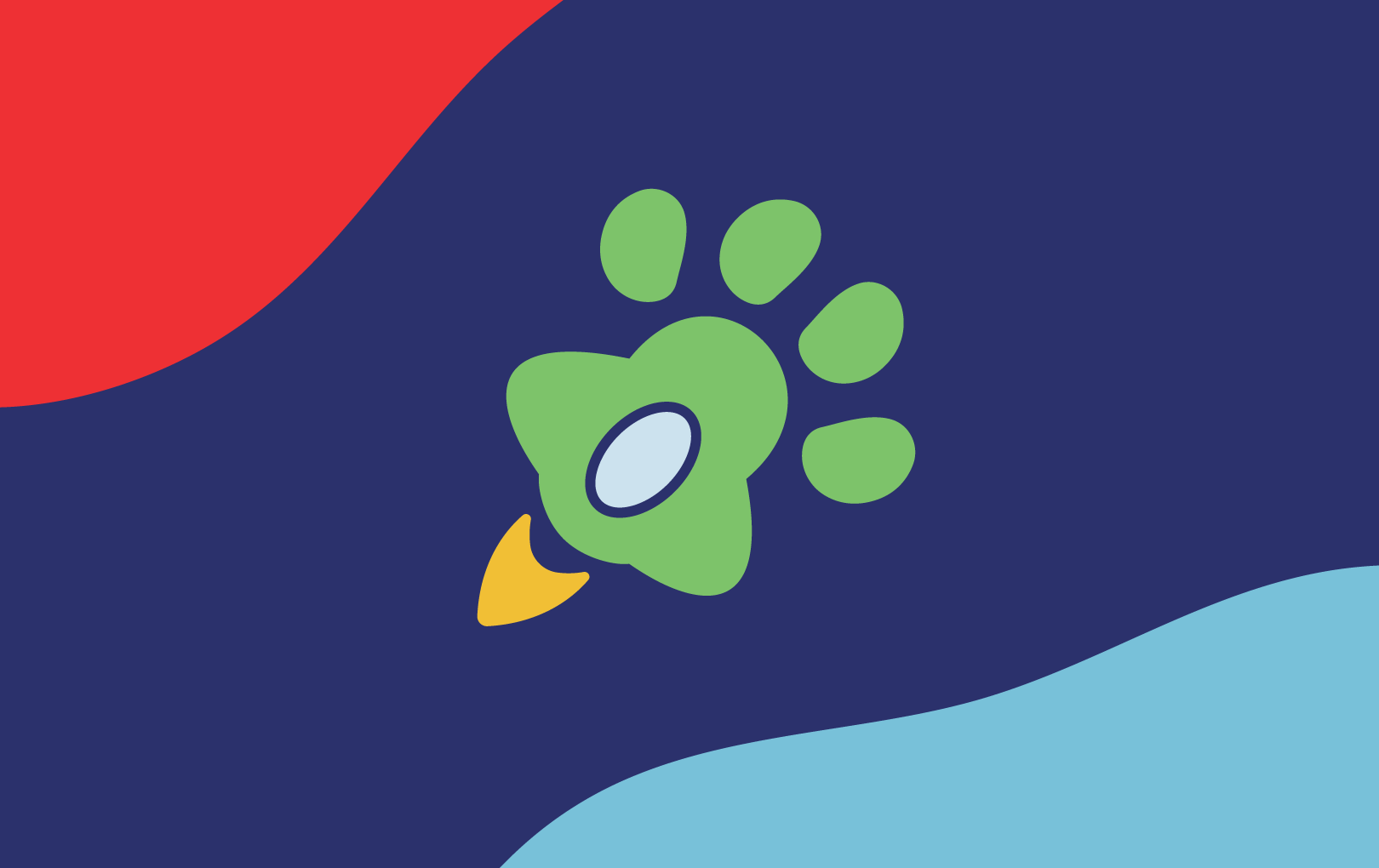
The final proposal centered most heavily on the mid-century modern theme evoked by the "Astro" name. I leaned fully into the 60s pop culture reference, riffing on the potential to use the shape of a paw to represent a rocket or space ship (later dubbed the "pawket"... as in paw-shaped rocket), with googie-inspired blobs and bright primary colors forming the basis of the proposed brand language. This is the direction we ultimately selected.
Documenting design intent is a necessary core competency for design leaders.
Be it for a brand or a digital product, writing down how the elements you've created should be applied by others in a way that's clear, concise, and easy to understand is crucial to ensuring the integrity of the work. I built Astro's brand guide, a roughly 30 page document designed to give direction to those working with the brand and to serve as a launchpad for the brand to evolve over time.
Logo guidelines help users understand the purpose of the logo's several variations, and warn against incorrect uses.

A primary and secondary color palate ensure various applications and use cases match, even when held up next to one another.

Type samples and type harmonies (ratios between various acceptable sizes) help users make consistent and informed decisions when laying out new works.

The "rules" should never get in the way of doing the right thing. Astro's blobby logo form could conflict with the circular avatar containers on social media sites, so I defined a special way to handle that use case.
Ultimately...
Astro continues to pursue its mission to build a world with healthier, happier pets. I've been thrilled to unpack customer problems and work on product design, product management, and research planning for the company for nearly a year. I'm absolutely convinced that Astro, when it launches later in 2022, will be a winner.
Selected Works


This website ©2025 Adam Kuglin.
Trademarks are property of their respective owners.